
 Renata Tassinari | Entre Cores
 Renata Tassinari | Entre Cores
 Renata Tassinari | Entre Cores
 Renata Tassinari | Entre Cores
Renata Tassinari
From Aug 06 to Sep 04 2009
In 1943, Matisse observed: "I feel through colour, so my pictures will always be organised by it. Yet, this requires that the sensations be condensed and that the means employed be brought to their utmost expressivity." We wouldn?t expect it to be different from one of the greatest colourists of all time. But the painter has always expressed that little difference would make if he didn?t find the means of expression that became his work, and thus can be shared with other people. As Clive Bell once wrote, "no one ever felt for the sensible world how Matisse felt; or if felt, did not create an equivalent".
In his painting, the colour intensity reveals a certainty about the sensible reality, and, above all, about the possibility of establishing links in which both individuals and the world are configured simultaneously, without violence or submission. His paintings are the best example of this possibility. For sure, this relationship with the world does not characterise all modern painting. The German Expressionists, deeply influenced by Matisse, gave colours an almost opposite direction, in which the contrasts reveal a stridency, a conflict between individuals and the reality in which they live in.
Be it one way or another, it seems out of the question that almost all modern movements for which the colour was has important made the element access to the world, even if it threatened. With Andy Warhol, colours took on a new meaning. They hover about ghostly in high contrast traces obtained from a photo ? of Marilyn Monroe, Elvis Presley, of a racial conflict ?, without joining them. The matter of the world does not seem to find another determined way to show itself. And from this split between colours and things comes an elusive reality in which affirmation escapes insistently.
Renata Tassinari?s paintings are formed through changes undergone by the statute of colours and the reality in contemporary art. And I believe that her trajectory is representative of the changes that led the sensible world to an ambiguous position. In one of her first exhibitions in which she left tension with figurative aside ? in 1993, at the Galeria André Millan ?, her colours sought to maintain a waste material through the use of papers that stood between it and the canvases, as well as through the thickening of inks by adding wax. The result was a mixed intensity, as the materiality of the paint and paper, instead of emphasizing the vividness of colours, held its realisation, acquiring an excessive presence that could shadow the colours. Colour and material exchanged position incessantly, without the observer being able to connect to one or the other.
Two years later, at that same gallery, her paintings left aside this membrane that intruded between the colours and the canvas. However, both regular area of colour and their relationship deepened that coupling between the colour and its appearance that characterised the previous series, as if the split between colour and matter was responsible for the manner of appearance of their colours. Some areas of colour ? browns, reds, graphite, etc. ? were then strengthened by the use of encaustic, and the massive presence enabled by the wax seemed to return them to the associated mineral world. But by giving blue a similar density ? a tone that is usually linked to the representation of the atmosphere, of air, of the skies ? the artist put into question the mimicry between colour and materiality. And then blue, brown, red, and graphite returned to being just colours, as if such a name could still assign luminosities that aspired to a paradoxical and disturbing bodied aftertaste.
In Brice Marden?s encaustic paintings one could also identify a similar dilemma. Working with more translucent areas of colour than those of Renata Tassinari, the American painter provided a condition to colours in which, apparently, its phenomenon status, that is, an event that is configured before our eyes, regained intensity. As in the tradition of the coatings, colours seemed to follow the light movement that penetrated the wax?s surface, returning to our eyes after a journey that restored its density and experience. Similarly, the almost-tonality of many of these paintings ? the proximity of tones of colour groups ? enabled this movement of the constitution of the world, as the tonal proximity among the various areas of a painting relinked the perception to the observation of a match between sectors of the canvases, the tonality debasing the autonomy of each of the delineations, causing them to complement one another.
For Brice Marden and Renata Tassinari ? and the next issues could be identified in the works of several other contemporary artists such as Agnes Martin, Sean Scully, Jessica Stockholder, Cassio Michalany, Sérgio Sister, Paul Binder, Fábio Miguez, and José Bernnô, among others ?, the contemporary reality involves practices that hinder a strong experience of its events. Accordingly, colours should acquire a different meaning from which guide modern art. The reflectivity of the Matisse?s colours consisted in a question for the proper colours, the best way a blue or a red show up and, thus, provide an emancipatory experience of things that showed no embarrassment or harassment. For a considerable part of the best contemporary paintings this question has shifted, encouraging in colours a doubt on its own ability to deliver a reality experience.
In her 1998 exhibition, at the Valu Oria Galeria de Arte, Tassinari seemed to struggle to overcome this broken contemporary perception condition, trying to give paintings a more assertive and sensorial character. The colours abandoned the strictly delineated areas and impersonal voice, and subtle gestures, somehow Morandian, sought to reconnect doing and colour, activity and experience. For this, the artist also put aside the encaustic, and the more immediate presence given by oil led to the belief that the doubts were developed into some certainties.
The new route there did not, however, convince the artist. And in 2002, at the Galeria Baró Senna, Tassinari gave the impression of a radical, joyful and anxious attempt to give the colours affirmation and positivity. The plain and accurately delineated areas returned. And the highly contrasting colours coexisted with others almost opposite, tonal. If in one side the colour proximity was intense and praised the autonomy and sovereignty of certain experiences, the light tonal passages reminded us that in the sensible world there is no absolute, univocal definition or criteria, and that if we do not have a comparison principle, we cannot go much far. And again, elements of the same work casted doubts on the possibility a unit could provide a strong experience of things and situations.
Somehow schematically, Tassinari?s works suggested a constant oscillation between notions of almost opposite colours. For those who know more closely her working process, what stands out is, instead, the loyalty to the problems and questions that her own adventure raises. Nonetheless, the importance of her dilemmas, even if relying on a personal determination, comes precisely from the ability to get in touch with comprehensive and relevant situations of contemporary experience.
Not only have aesthetic transformations were given to the great modern artist who experienced the world of colour and the reluctant feelings of our days. The relevance of pop art resided precisely in a movement that went beyond the generalisation of the media and images, with the consequent recognition that in many situations it would not be possible to have a direct experience, it would be necessary to incorporate works of art to mediation of second-hand knowledge. The social life itself has acquired a volatility that reinforces the difficulty of finding an effective way of perceiving the world.
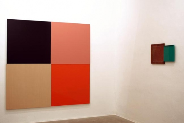
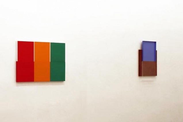
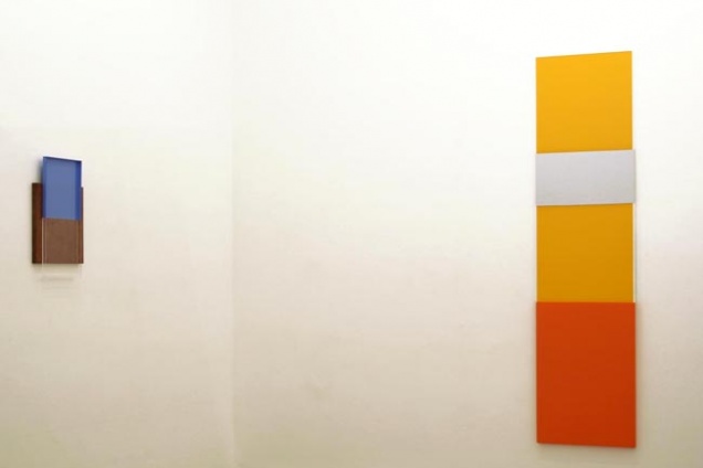
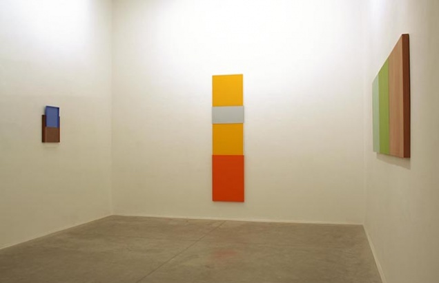
From 2005, Renata Tassinari has been conducting her painting into a growing impersonality. Coloured areas became more regular, the fissure has almost disappeared, hues gained a broader spectrum ? before, the artist had a much more characteristic palette ? and some materials (acrylic and wooden plates) were included in the works, with a similar status of the painted surfaces. The inclusion of elements could give works a greater concreteness, somehow distant from the more optical size of the coloured surfaces. However, the final appearance of the works shows ambiguity, oscillating between the artificiality of a mobile kitchen and the subtleties of Venetian Renaissance painting, among the thoughtless evidence of saturated tones of a webpage and a complex balance, obtained from an extreme familiarity with the colours and the way it is arranged on a surface.
In several of the works carried out in recent years, the artist uses acrylic sheets, which are painted behind. In these areas, the observer remains in a paradoxical situation that I believe summarises the enigmas and dilemmas that Renata Tassinari incorporated in her painting, and reveals the importance of the issues that always guided her. By having its inner side coated with a colour, acrylic sheets become even more reflective. Before it, the observer has his/her attention awakened by the brightness produced by it, indicating at the same time a radical colour intensity and its impossibility, as the colours themselves are cushioned by a thick layer of matter ? a transparent material, no doubt, but one that numbs the ability of colours to affect our sensibility.
And I am convinced that this characteristic of certain areas of her painting ends up impregnating the regions where the colours are shown directly, those in which the artist paints on other surfaces (acrylic or not), further strengthening our senses and desire to adhere to something less ambiguous and elusive. And in this game, the very intensity of the phenomena ends up revealing more artificiality of its condition than the ability to refer to the reality and its meanings. In front of these paintings, while experiencing something of the vividness of natural colours ? green leaves of a tree, for example ? plus the attractive neutrality of a Coca-Cola ad. And, in vain, we strive to unite two phenomena that, for now, still seem to have incompatible natures. This can be uncomfortable, but remarkably recalls the way of life we lead.